Demo Nº 01Live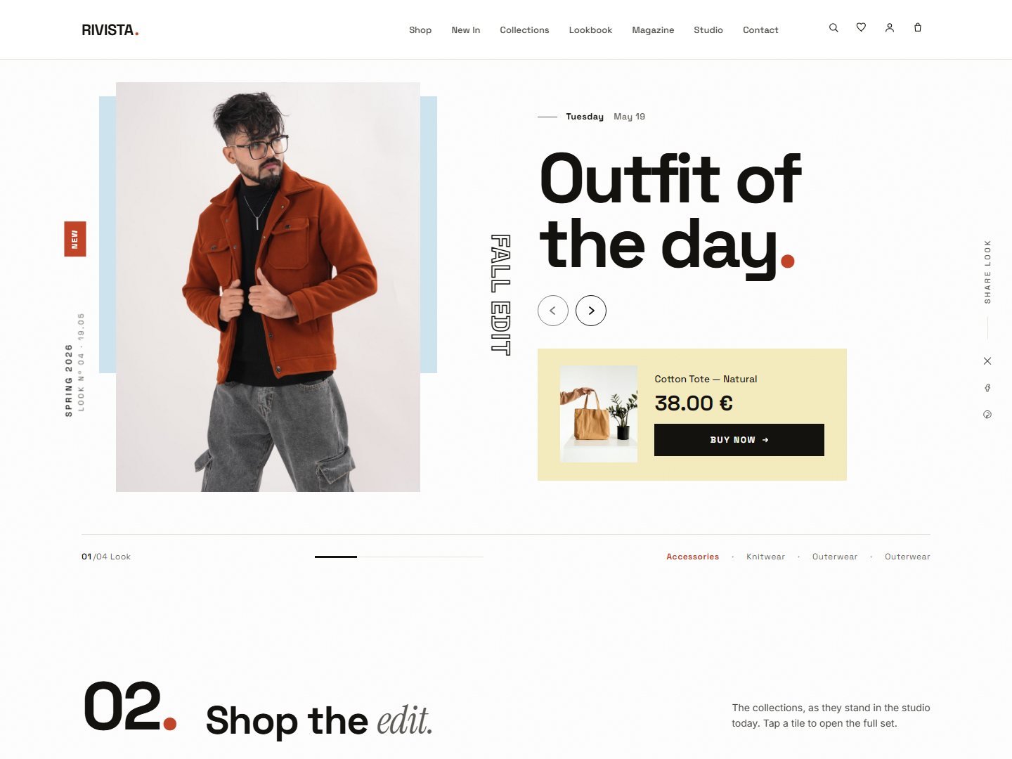
Editorial — Quiet
The flagship. Warm cream paper, ink type, terra accent. For slow-fashion brands that prize whitespace and rhythm.
RIVISTA ships with twenty pre-built homepages — five styled directions, five hero-slider concepts and ten motion and layout studies — all sharing the same components, pages and code. Import any one with a single click.
The flagship. Warm cream paper, ink type, terra accent. For slow-fashion brands that prize whitespace and rhythm.
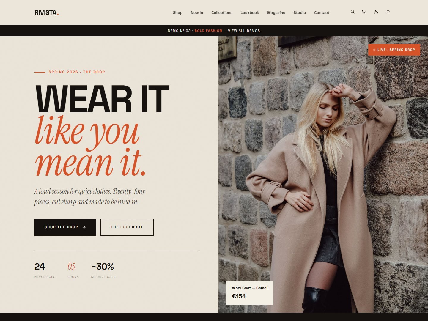
Magazine-cover energy. Vivid terracotta on warm cream, brutalist tiles and marquee headlines. For streetwear and statement brands.
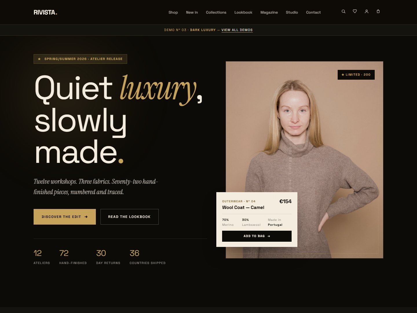
Restrained black with warm gold. Generous whitespace, light type, an atelier feel. For luxury boutiques and made-to-order labels.
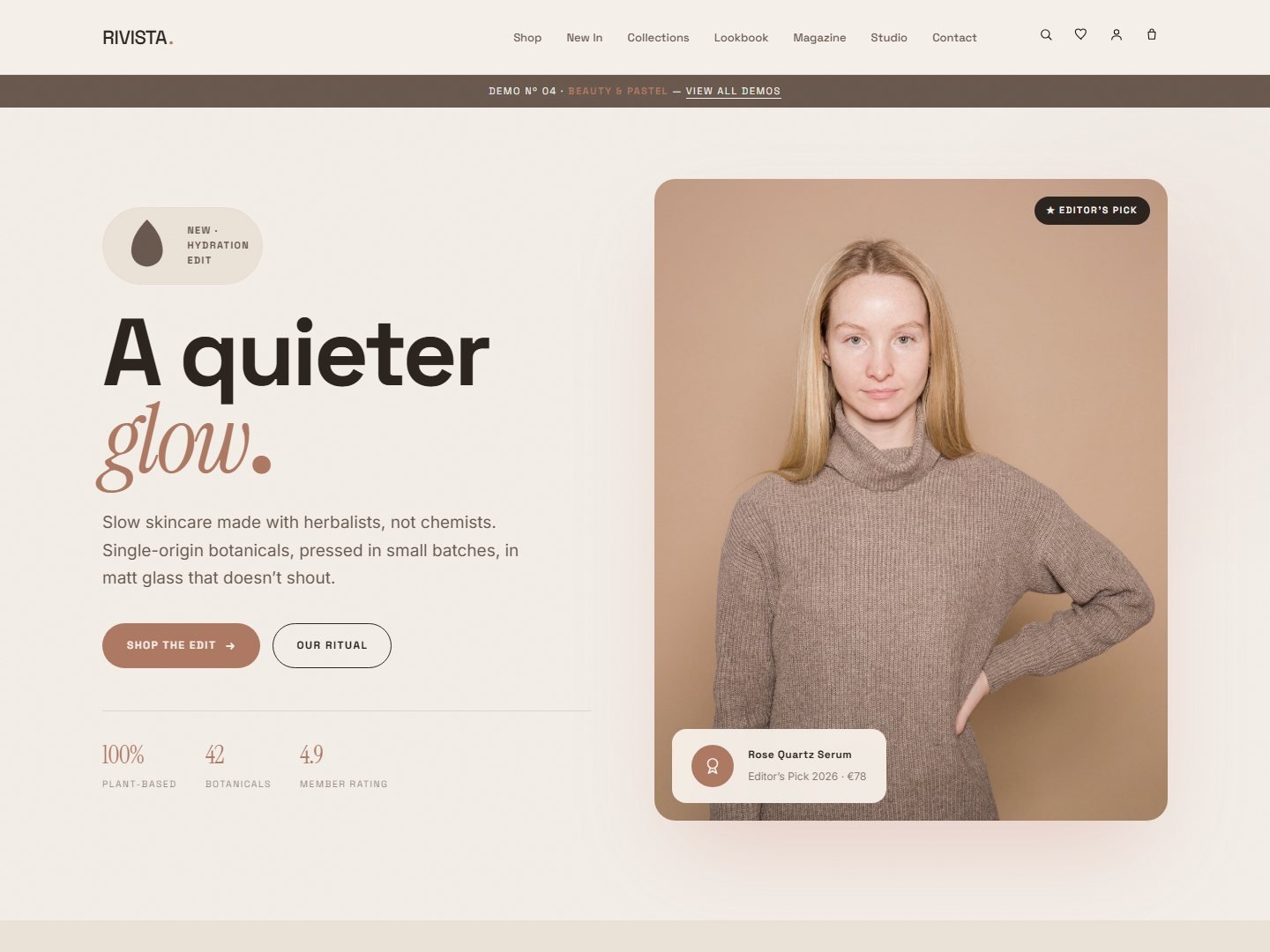
Skincare, fragrance and beauty boutiques. Soft blush, dusty cream and mint — rounded forms and gentle gradients.
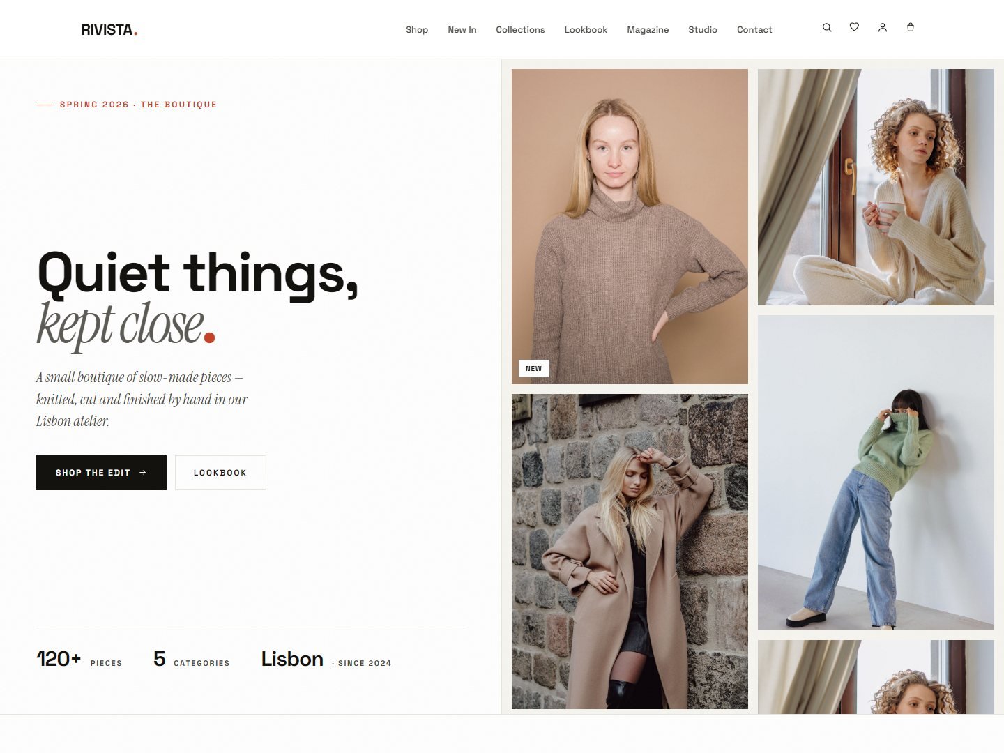
Furniture, ceramics and lighting. Warm neutrals, a clay accent and large architectural rooms.
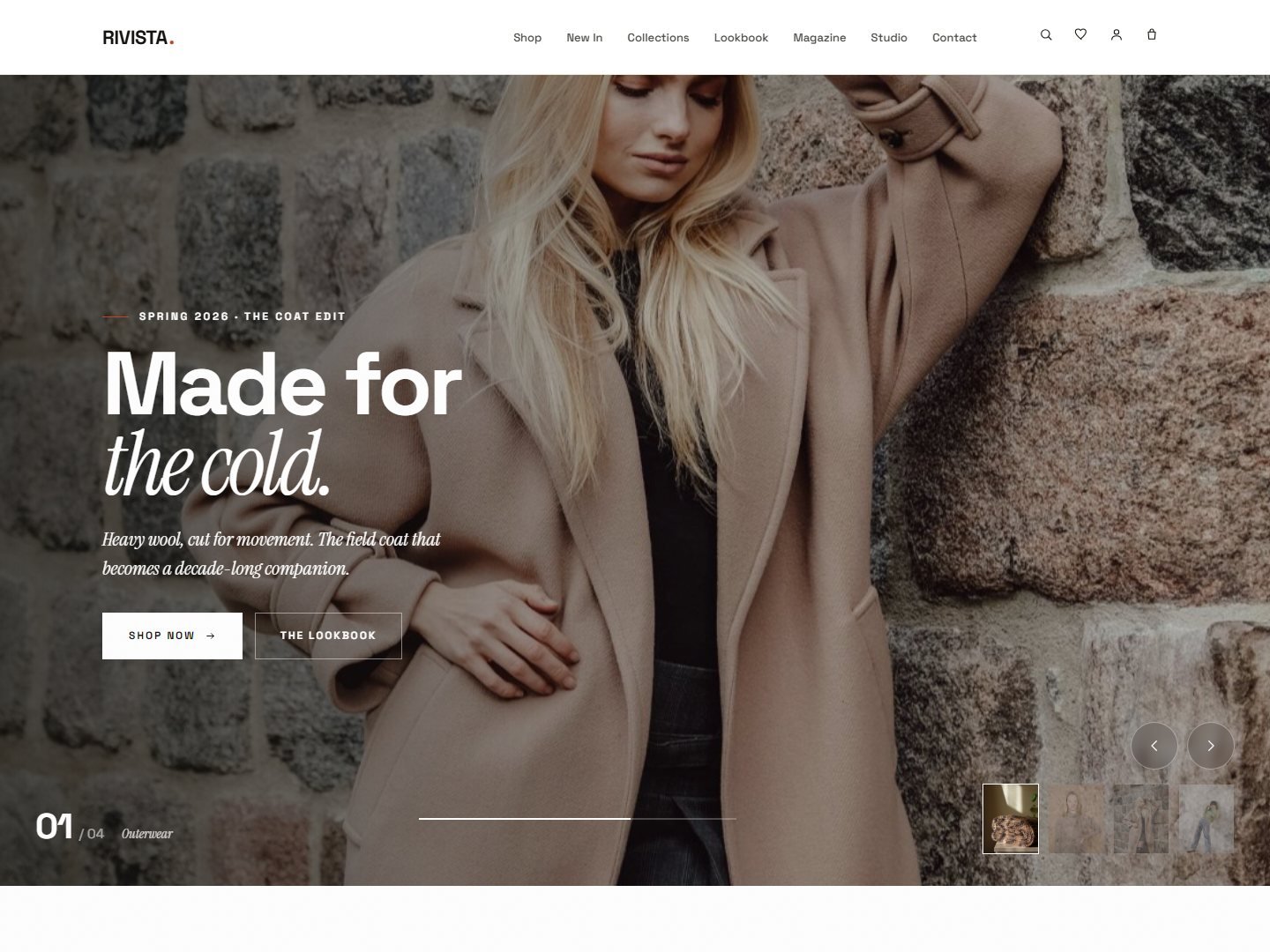
A cinematic full-screen hero slider — crossfade, Ken Burns, thumbnails and a progress bar.
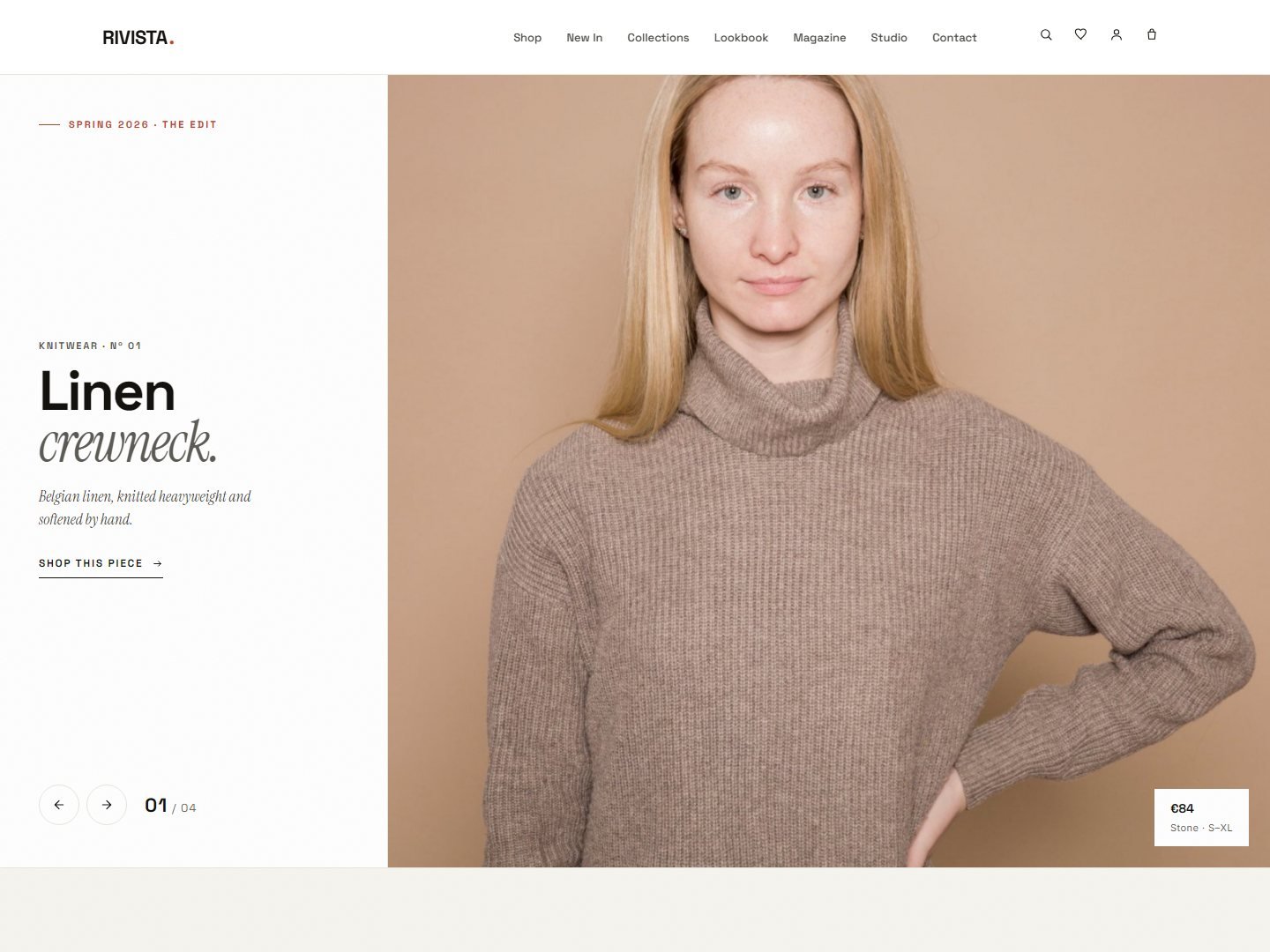
A vertical split slider — a fixed text column beside a full-height image that wipes between pieces.
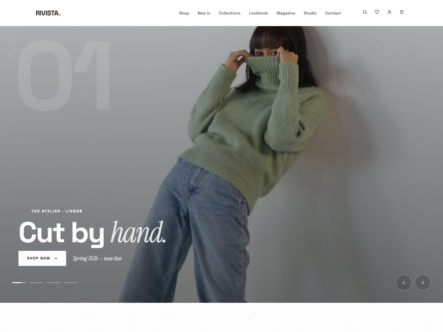
A horizontal filmstrip — slides push sideways behind a giant index number, with drag and dots.
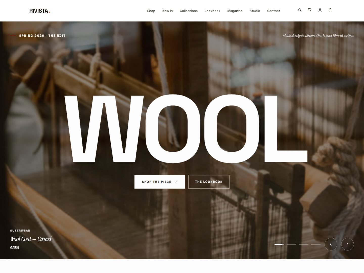
A giant word with the product photo poured inside the letters, cycling between pieces.
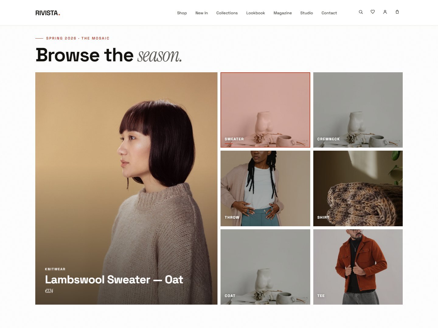
A tile grid where the big feature swaps as you hover — browse the whole season at a glance.
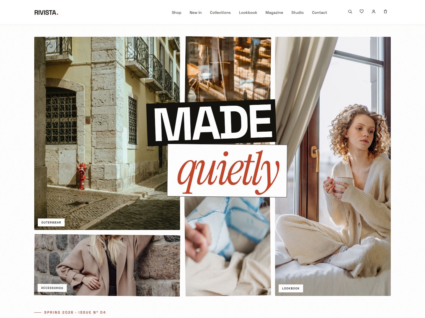
Overlapping cut-outs and captions — a scrapbook hero for lookbooks and editorial drops.
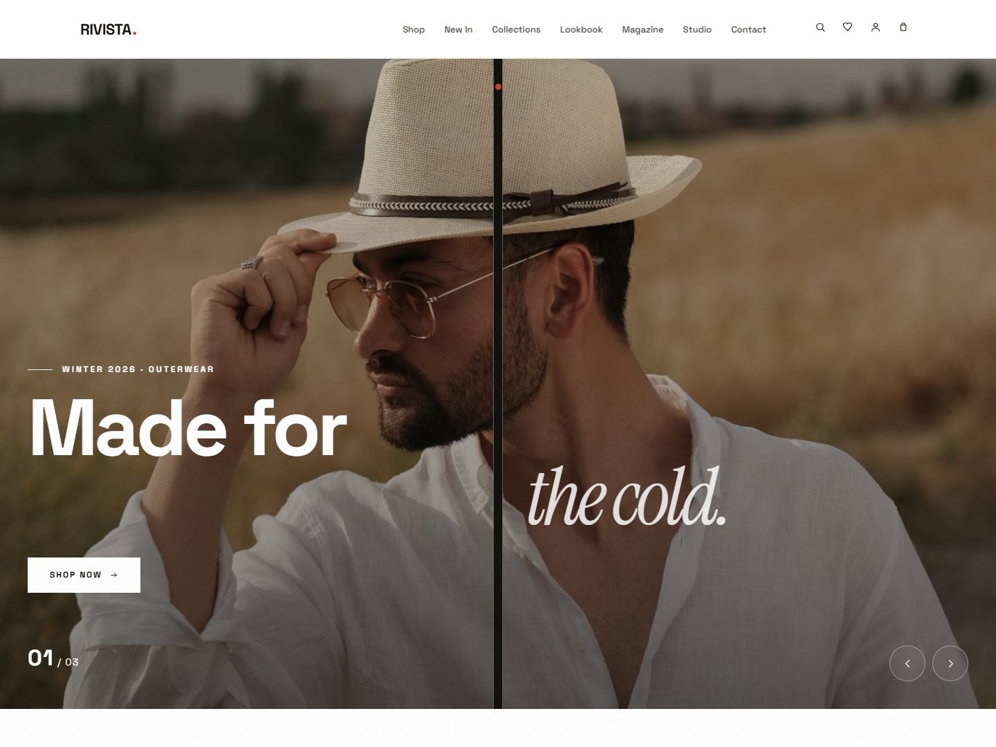
Panels part like a stage curtain to reveal the season — a theatrical opening.
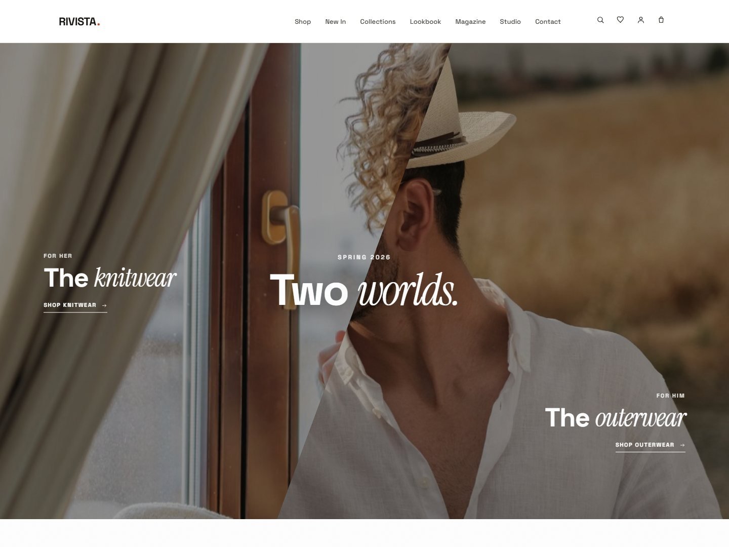
Slanted sections and diagonal splits — energetic layouts that cut across the grid.
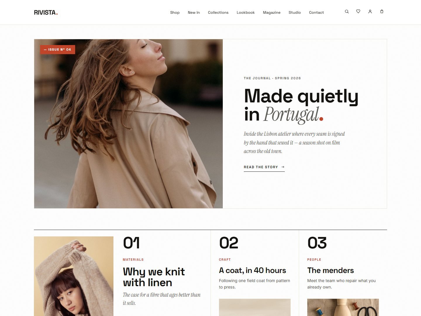
An editorial magazine front — columns, rules and a featured story lead. For content-led brands.
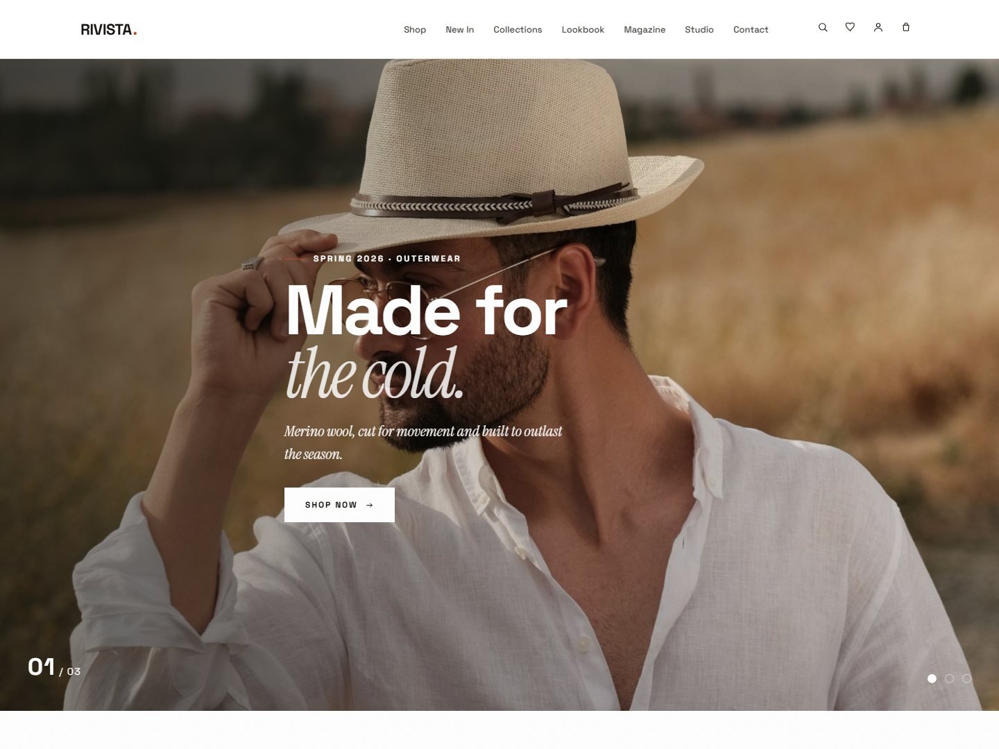
Scroll-driven reveals — pieces fade and rise as you move down. Calm, considered pacing.
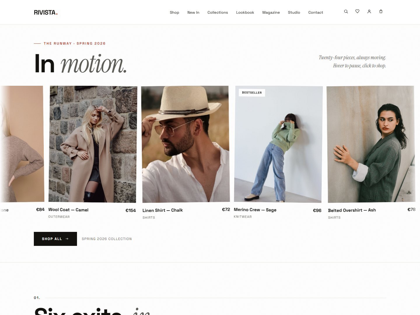
A vertical runway of full-bleed looks — one head-to-toe outfit per screen.
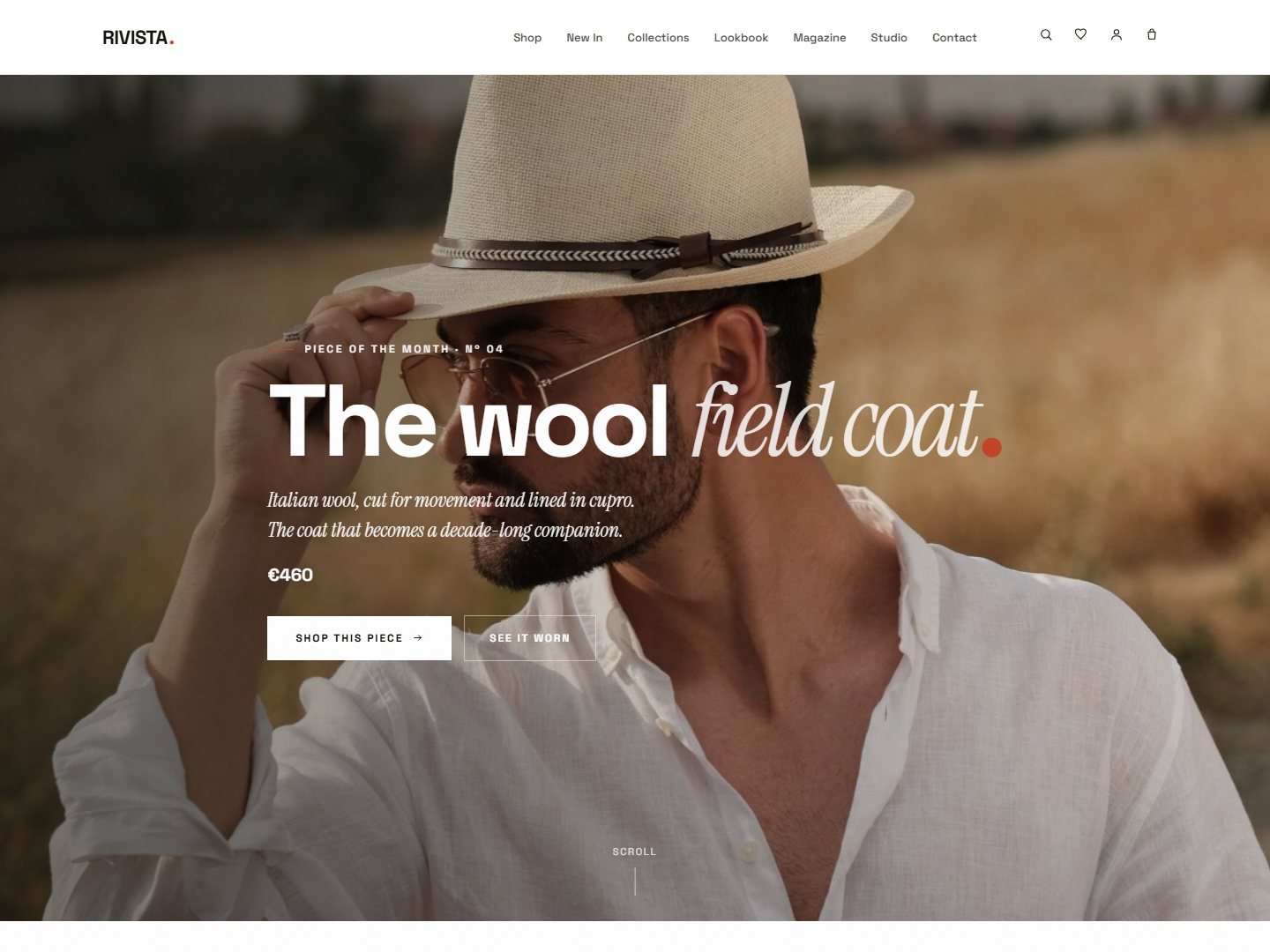
A single hero piece under a spotlight with the rest dimmed. For hero-product launches.
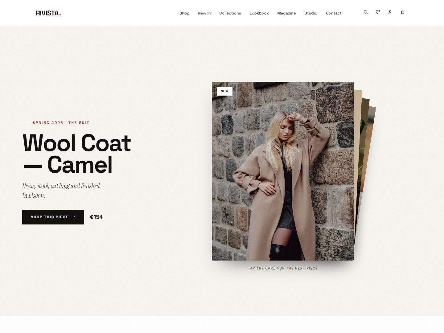
Cards stack and peel as you scroll — a tactile, layered way to move through the season.
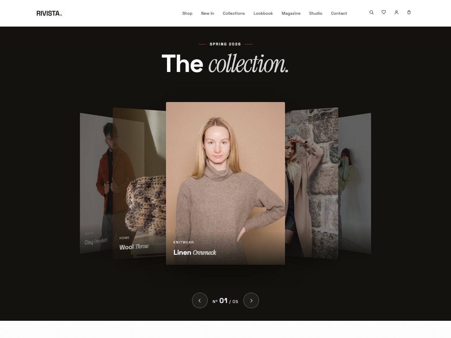
Subtle 3D tilt on hover and scroll — product cards that lean toward the cursor.
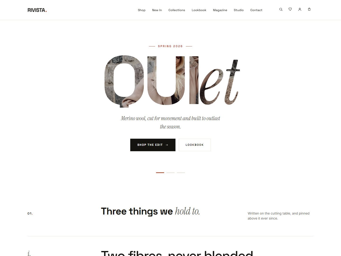
Type as the whole layout — oversized words carry the page, images play a supporting role.
Every demo runs the same fully-built WooCommerce storefront. These are wired in, not add-ons.
Save pieces and line them up side by side — persisted, no plugin needed.
Open any product in a modal without leaving the grid. Add to bag in place.
A buy bar follows the shopper down long product pages.
Guarantee rows under the buy box, an “Only N left” badge on cards once you manage stock, and a mini-cart meter that reads your real free-shipping rule.
Switch it on in the Customizer and visitors can try the colour packs, typefaces and dark mode themselves. Off by default, so a live store shows the pack you picked.
Arabic and right-to-left languages handled across every page.
All 66 demo pages, the twenty homepages among them, are in the same download — along with the updates your marketplace licence covers.